signage Research
SIGNAGE I LIKE:

I like the neon light of this signage. It conveys an artsy and cool feeling, which fits the theme of this building, an arts building.

I like the design of this ice cream car because it conveys concise messages. I know what they have just by a glance when I pass by. The pictures and purple theme color show a cute feeling, which I feel that is essential to an ice cream vendor. It is selling a feeling, come buy this ice cream, and you will feel happy.
signage I don’t like:

Besides it seems like someone draw on the sign, the arrow is a bit vague. After thinking about it for a second, I feel it is saying do not park bike on the rail. I wish it could be more clear about where not to park. I noticed that there are many kind of arrows like this in NYC, feeling where it is pointing is often vague.

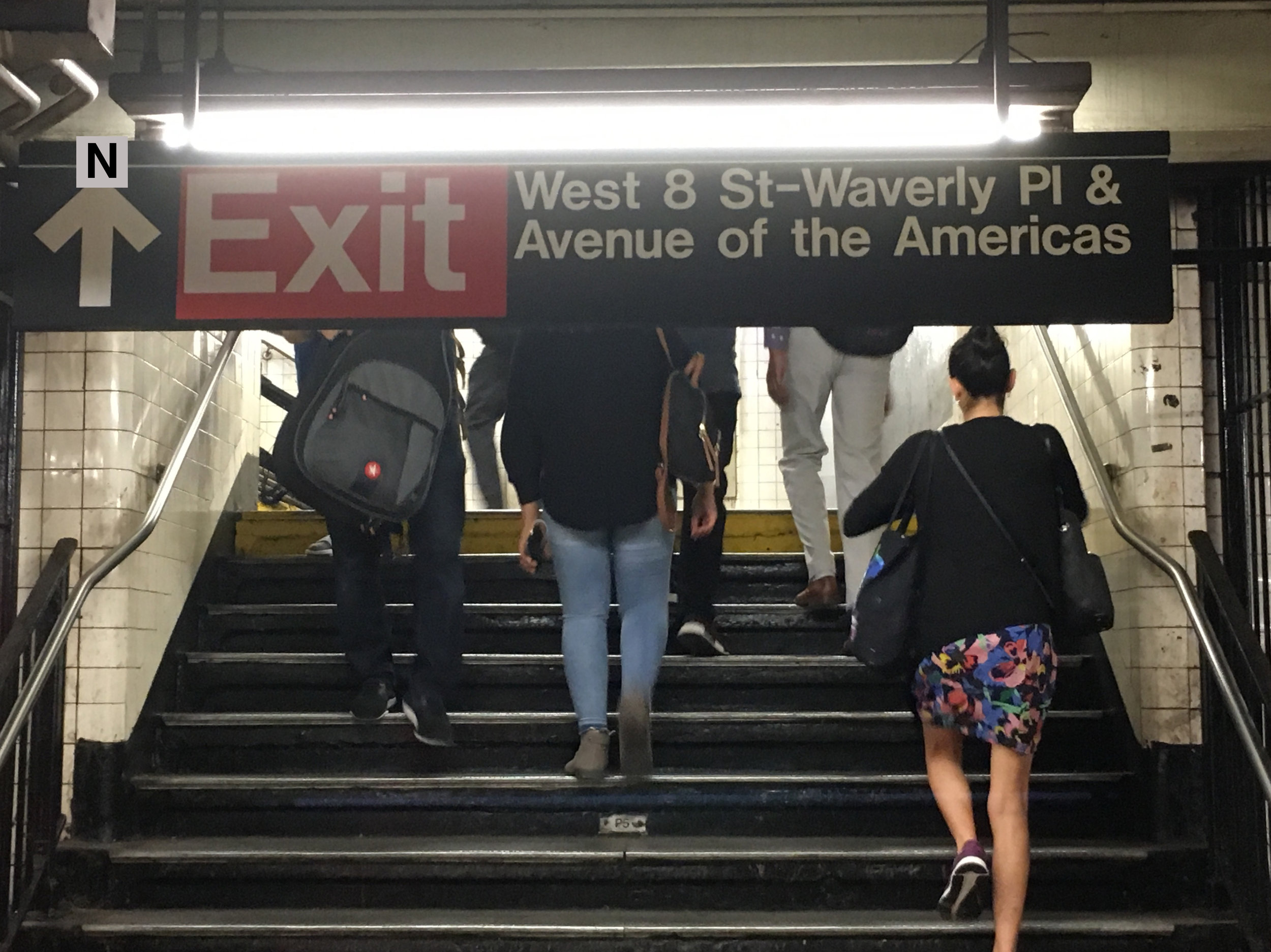
I am not the only one who feel NYC subway confusing. It is often difficult to find the right exit if you are at this station for the first time.
re-design
RESEARCH:
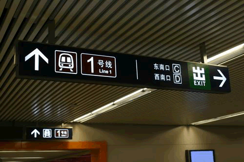
In Beijing, I feel the subway is much easier to navigate than New York. All subway exits are lettered, like exitA (NorthWest), exitB (NorthEast), etc. Also, there are signs about where you can go at each exits.

DESIGN:
So, I added direction to the NYC subway exit sign.